Taskmaster
Taskmaster is a skill-development website that allows users to track their progress and set goals for themselves when developing a skill. I created this project as part of my enrollment in Phase 1 of UX Academy’s UX Design bootcamp.
Finding A Place To Start
Before jumping into the design of Taskmaster, I began this project by looking to existing skill-development websites to see what already existed in the industry. I found the most popular sites and conducted a comparative analysis, taking note of which features were shared across multiple websites and what sort of skills were most popular. I concluded that while many of the websites I found offered excellent career-building and professional courses, many of those sites were more focused on helping users acquire skills quickly instead of consistently building a skill over time.
Identifying Users
After completing my comparative analysis, I moved on to user interviews. I sat down with multiple people either currently pursuing or interested in beginning a hobby to determine what issued caused them to struggle long-term. The three roadblocks every person interviewed brought up were procrastination, burnout, and time management.
In order to keep these three roadblocks in focus, I created personas to identify what I felt were the three major types of skills Taskmaster would be designed for tracking: technical, creative, and recreational skills. I set out to create a website that would allow users to stay on track by breaking down their skill development into smaller, manageable goals while giving them the flexibility to determine their own schedules.
Persona A - Technical Skills
Persona B - Creative Skills
Persona C - Recreational Skills
Site Planning
Taskmaster is structured into three tiers, with the lower tiers becoming more tailored to a user as they set up their account. The main functionality of the site centered around user-generated milestones, called ‘Tasks’. Each Task was created with a deadline and a deliverable, both set by the user but able to be adjusted later. Task deliverables were as complex or simple as a user wished; ranging from either a written self-reflection, an upload, or a simple checkbox.
Drafting
The earliest drafts of Taskmaster’s visual design were heavily inspired by existing websites such as Google Calendar or Designlab. The elements I wanted to ensure were useable were a scrolling timeline that compiled all created Tasks in chronological order and a progress tracker that shows the user their quantified completion rate. As I began to plan out further functionality, separate scheduling and calendar pages became necessary in order to ensure users total flexibility when planning out their goals.
Wireframing
After receiving feedback on my designs from mentors and colleagues within the UX Academy program, I digitized them in order to create the first wireframes for Taskmaster. At this stage, I focused on creating a clean, intuitive UI that would be as unobtrusive as possible for a potential user.
Polishing & Prototyping
During the process to take Taskmaster’s wireframes from low- to high-fidelity, I spent a long time ensuring that the visual design and branding were consistent with my design goals. I chose calm, quiet colors to avoid user distraction while emphasizing contrast and readability to ensure ease of use. My goal during this stage was to apply the created UI into a polished, professional-looking planning website.
Once the final wireframes of Taskmaster were approved by UX Academy, I used Figma to create a rough prototype for a few rounds of user testing. The prototype tested the usability of the website’s core features, such as Task creation, scheduling, and ease of navigation. Unfortunately, testing revealed that much of the UI was confusing and difficult to navigate. While the visual design of Taskmaster was strong, many of it’s features were repeated too many times or were located in unorthodox places that inhibited testers’ abilities to navigate.
Revising the Prototype
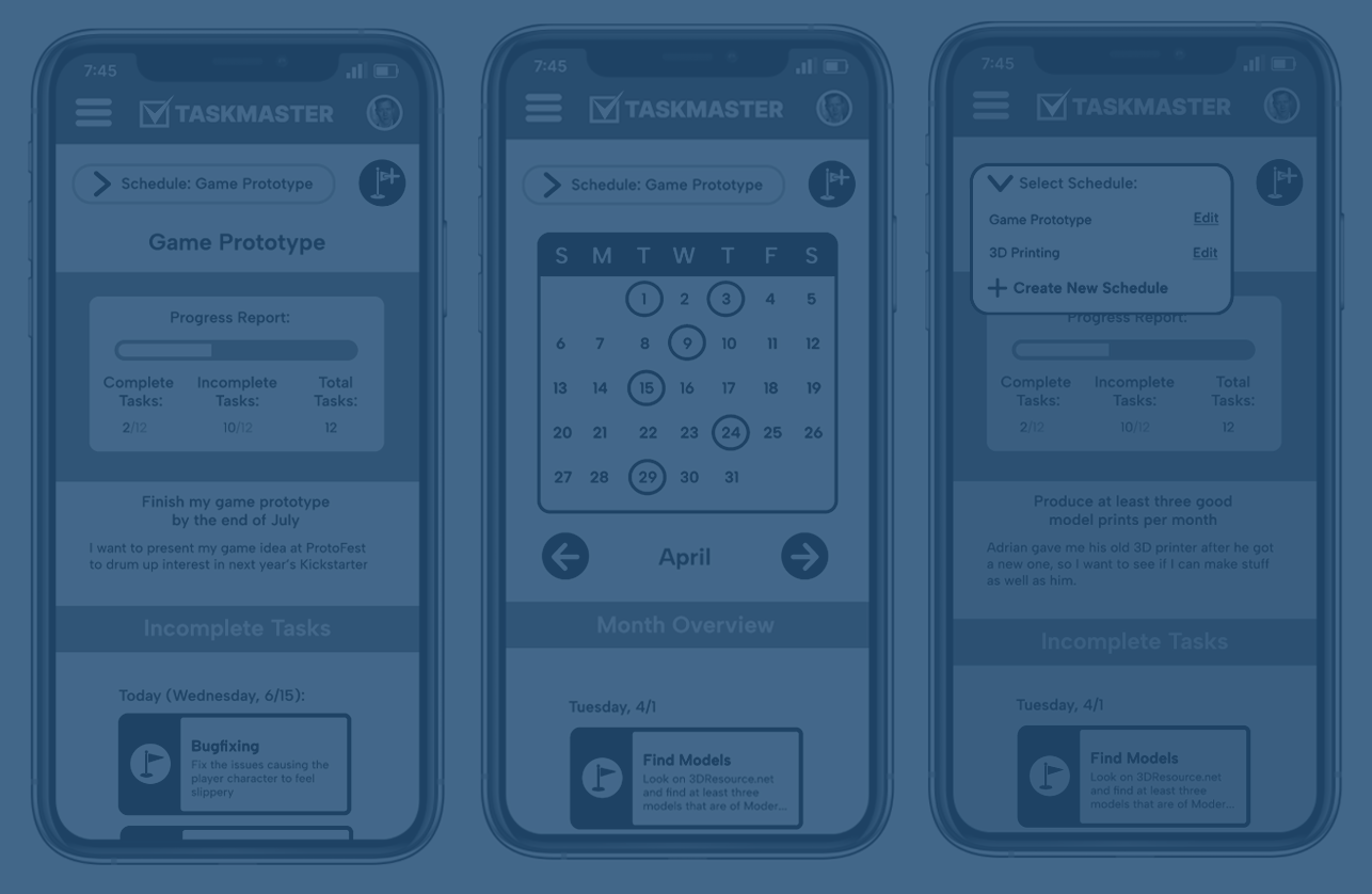
After the first round of user testing I remade Taskmaster’s wireframes to correct the identified navigational issues. The second iteration of my prototype condensed features that were formerly spread throughout a page to a single bar at the top of each, ensuring that they were always immediately available. The original homepage and scheduling pages were also combined into a single dashboard to cut down on the amount of navigation required to view a user’s entire schedule.
Conclusion
Overall, Taskmaster was an informative project that helped me understand the amount of preparation and testing that goes into UX design. I learned about the value of user interviews and flow design, both of which helped me avoid unnecessary work and narrowed my focus towards the most important elements needed to accomplish this project. Although I encountered issues with my UI design during user testing, my problems were minimal and easily fixed upon further iteration. This was an excellent introduction to my new career path and a perfect practice case for future projects!


